2023-08-22 00:00:00
7 min read
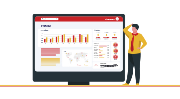
Imagine if data could be transformed into a vibrant canvas where trends and relationships emerge as hues and intensities. This is precisely what a heatmap does. It's a graphical representation that employs colors to showcase data distribution and variations. As you embark on this journey through our blog, we'll not only unravel the magic behind heatmaps but also equip you with the know-how to create your very own using Tableau, a versatile platform renowned for crafting captivating visualizations. So, get ready to transform raw numbers into captivating visual stories!
Consider a retail store analyzing its sales data over a year – a heatmap can swiftly identify the peak sales periods and the products that generated the most revenue during those times.
Similarly, in biology, heatmaps are invaluable for visualizing gene expression patterns across various samples. Whether it's understanding customer behavior, tracking performance metrics, or analyzing scientific data, heatmaps are an essential ally in the realm of data exploration.
In this blog, we're going to unravel the mechanics of creating these insightful visuals using Tableau, opening doors for you to unravel insights within your own data.
Preparing Data for Heatmaps
Data Requirements:
To set the stage for a successful heatmap, your data should have a combination of categorical and numerical attributes. Categorical data defines different categories or groups, while numerical data provides the quantitative values associated with those categories. This combination allows the heatmap to shine a light on the relationships between these categories and their corresponding values.
Imagine having sales data for different products (categories) over various months (categories again), each with their respective revenue figures (numerical values). This is the kind of data that lays the foundation for an informative heatmap.
Data Cleaning and Formatting:
Similarly, your data needs to be clean and structured to create an accurate and insightful heatmap. Before diving into visualization, it's essential to ensure that your data is consistent, free from errors, and organized in a way that makes sense.
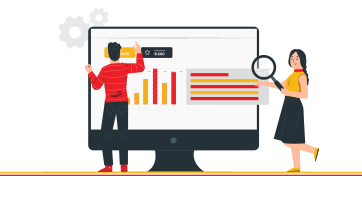
Setting Up Tableau for Heatmap Creation
Creating your heatmap using Drag and Drop approach:
Select Data Source: After opening Tableau, click on "Connect to Data" and choose your prepared dataset.
Drag Dimensions and Measures: Drag a categorical variable to the Columns shelf and a different categorical variable to the Rows shelf. For instance, if you have sales data, you could place "Product Category" on Columns and "Month" on Rows.
Measure Placement: Drop a numerical measure, like "Sales Revenue," onto the Color shelf. The color intensity will now represent the values of this measure.
Instant Heatmap: Voila! Your basic heatmap is ready. The varying color shades will reveal patterns and trends in your data. Tableau's default settings will choose suitable colors.
Customizing the Heatmap:
A bit of personal flair can make your heatmap truly shine. Here's how you can add those special touches:
Color Customization: Click on the Color shelf to modify the color palette. You can choose from gradients, diverging colors, or create a custom scheme that fits your data's context.
Labels and Tooltips: To provide context, you can add labels to your rows and columns. Tooltips, those small information pop-ups, can give extra details about each cell's data point. This enhances your viewer's understanding.
Axis and Titles: Tidying up is essential. Add meaningful titles to your axes and the heatmap itself. This helps your audience quickly grasp what they're seeing. Also, adjust axis labels for readability.
By following these steps, your basic heatmap will evolve into a customized visualization that's not only informative but also visually appealing.
Steps to enhance your Heatmap
Adding Context with Filters:
A truly captivating visualization doesn't just show data; it tells a story. Filters provide the plot twists that make your heatmap narrative compelling. Here's how you can add layers of context:
Filter Application: Select relevant dimensions, such as "Region" or "Product Category," and create filters. These filters act as magnifying glasses, allowing you to zoom in on specific data subsets.
Interactive Exploration: Make your heatmap interactive by dragging filters onto your dashboard. This empowers your audience to dynamically control what they see, making the exploration process engaging and insightful.
Using Parameters for Interactivity
Imagine having the power to change a painting's color palette with a flick of your wrist. Parameters in Tableau offer similar enchantment to your heatmap:
Introduction to Parameters: Parameters act as dynamic variables that let you adjust visual aspects, like color schemes or thresholds, on the fly.
Steps to create Parameters on Tableau:
1. Open Your Worksheet:
- Start by opening the worksheet where you want to create and use the parameter.
2. Go to Data Pane:
- On the left-hand side of the screen, locate the "Data" pane. This pane shows your data sources, fields, and other related items.
3. Right-Click and Create Parameter:
- Right-click anywhere within the "Data" pane, and from the context menu, select "Create Parameter."
4. Define Parameter Details:
A dialog box will appear, allowing you to define the parameter's details:
- Name: Give your parameter a meaningful name.
- Data Type: Choose the appropriate data type for your parameter. This could be string, integer, float, etc.
- Allowable Values: Select how you want to set allowable values for your parameter. You can choose from a list, range, or all values.
- Current Value: Set a default value for the parameter.
- Set Parameter Values: Depending on your chosen allowable values, set the values accordingly. For example, if you're using a list, input the values you want to include.
5. Show Parameter Control:
- Once you've defined your parameter, you'll want to show it on your worksheet for interaction. To do this, right-click on the parameter's name in the "Data" pane and select "Show Parameter Control." This will add a control element to your worksheet.
6. Use Parameter in Visualizations:
With the parameter control visible, you can now use it in your visualizations. For instance, if you're using the parameter to control the color scheme of a heatmap, you can use the parameter as a variable in your color calculations.
7. Test and Refine:
Interact with the parameter control to see how it affects your visualization. You can adjust the parameter's value and observe how it alters the display. You might need to refine the parameter's settings based on the desired interactivity and outcomes.
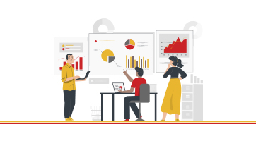
Advanced Heatmap Techniques:
Dual-Axis Heatmaps
Consider using dual-axis heatmaps when you have two measures that might have different scales but are still related. For instance, you might want to visualize both revenue and profit margins for different product categories.
Steps to create a Dual-Axis Heatmap in Tableau
1. Open Your Worksheet:
- Begin by opening the worksheet where you want to create the dual-axis heatmap.
2. Drag and Drop Dimensions and Measures:
- Drag a categorical dimension to the Columns shelf (for X-axis).
- Drag another categorical dimension to the Rows shelf (for Y-axis).
- Drag your first measure (let's call it "Measure A") to the Marks card, typically onto the "Color" shelf. This measure will determine the color intensity of the heatmap.
3. Create the Second Measure:
- Duplicate "Measure A" by right-clicking on it and selecting "Duplicate."
- Drag the duplicated measure (now called "Measure A (2)") to the same Marks card but on a different shelf, such as "Size."
4. Adjust Marks Card:
- On the Marks card, click on "Size" shelf and choose "Fixed" for sizing.
- Adjust the size of the marks to your preference; this will determine the size of the heatmap cells.
5. Synchronize Axes:
- In the Columns shelf, click on the dropdown arrow (small triangle) next to the dimension, and select "Dual-Axis."
- This will create two sets of axes.
6. Adjust the Second Axis:
- On the second axis (right side), right-click on "Measure A (2)" and choose "Dual-Axis" again to synchronize the scales.
- Then, on the second axis, click on the "Size" shelf and choose "Fixed" for sizing as well.
7. Adjust Sizing and Opacity:
- On the Size shelf of the first measure, adjust the size of the marks to your preference.
- You can also adjust the opacity of the marks to ensure visibility of both layers.
8. Customize Colors:
- Customize the color schemes for both measures by clicking on the Color shelf of each measure.
- Ensure that the colors you choose are distinct and convey the necessary information.
10. Label and Title:
- Add axis labels and a title to help viewers understand the content of your dual-axis heatmap.
11. Refine and Format:
- Play with the layout, formatting, and labels to ensure clarity and aesthetics.
12. Test and Interact:
- Interact with the dual-axis heatmap by applying filters or drilling down into specific data points to extract insights.
Density Heatmaps:
Imagine using a magnifying glass to explore tiny details within a painting. Density heatmaps do something similar for data, revealing distribution patterns that might otherwise go unnoticed:
Steps to create a Density Heatmap on Tableau:
1. Open Your Worksheet:
- Start by opening the worksheet where you want to create the density heatmap.
2. Drag and Drop Dimensions and Measures:
- Drag a geographical dimension (like Latitude and Longitude) or a time-based dimension to the Columns and Rows shelves.
- Drag your measure, which represents the data density, to the Marks card. It's often a count of records or a measure that signifies data concentration.
3. Choose the "Density" Mark Type:
- On the Marks card, change the mark type from the default to "Density."
4. Adjust the Size and Opacity:
- On the Size shelf of the density marks, adjust the size of the marks to control the density area size. Larger marks indicate higher data density.
- You can also adjust the opacity of the density marks. Higher opacity makes dense areas more visible.
5. Customize Colors:
- Customize the color scheme of the density heatmap by clicking on the Color shelf.
- Choose colors that effectively represent the density levels, with darker colors for higher density areas.
6. Add Labels and Tooltips:
- Consider adding labels to the axes to provide context for viewers. You can also customize tooltips to display additional information when users hover over density areas.
7. Refine and Adjust:
- Fine-tune the sizing, opacity, and color choices to ensure that the density heatmap effectively highlights data distribution patterns.
8. Interactivity:
- If desired, you can add filters, parameters, or actions to enhance interactivity. For example, users could select a specific region or time period to see how density changes.
10. Testing and Review:
- Interact with the density heatmap to ensure that it accurately represents data distribution and provides meaningful insights.
11. Save and Share:
- Once you're satisfied with the density heatmap, save your worksheet and consider sharing it as part of a larger dashboard or presentation.
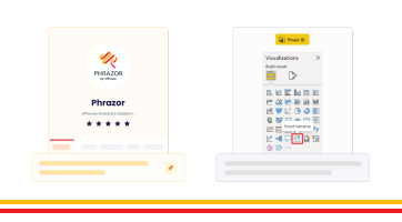
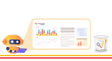
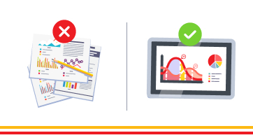
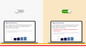
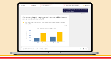
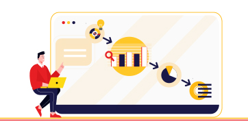
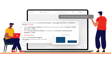
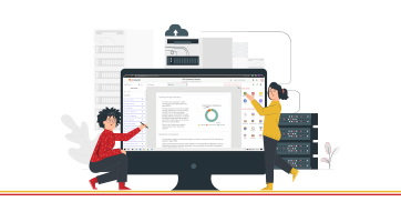
As you've learned, a heatmap isn't just a canvas of colors; it's a window into data's hidden stories. But what if we told you there's a way to take your visualization to an even higher level? Allow us to introduce the Phrazor Extension for Tableau. With Phrazor, your heatmaps and dashboards transform into insightful narratives, delivering a clear and coherent storyline to your business users.
Phrazor generates narrative insights that summarize the visualization's essence, making it easy for anyone to understand the underlying insights. Plus, the ability to drill down into these narratives uncovers the potential causes behind trends and anomalies. This fusion of data visualization and narrative intelligence empowers you to not just show data, but to tell its story – a story that resonates and drives informed decision-making.
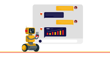
About Phrazor
Phrazor empowers business users to effortlessly access their data and derive insights in language via no-code querying